
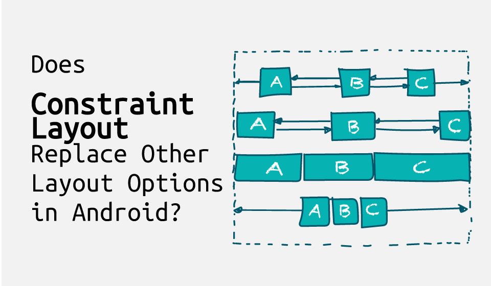
Even though Jetpack Compose has become the recommended tool for building Android applications’ UI, the vast majority of applications still use traditional layout modes and their XML-based syntax. Android SDK provides us with many layout options. Some are already obsolete, but others remain popular and are widely used, including the newest offering: ConstraintLayout. Before we assess which options are actually effective, let’s briefly review the basics of the Android layout system.
Android Layout Basics
The fundamental building block of UI in Android is the View class, which represents a rectangular area on the screen. It’s also a base class for specific views like Button and ImageView. On top of them are ViewGroups—special Views that are used as containers for other views. ViewGroup is also the base class for various layout classes.
Android offers multiple layout options, including RelativeLayout, FrameLayout, and LinearLayout. However, back in 2018, ConstraintLayout was introduced, presumably, to rule them all. But does it live up to the hype? Let’s find out by looking at an example.
Android Layout Example
Let’s pretend ConstraintLayout doesn’t exist and build a UI for the login screen of our Layout Guru application using only pre-ConstraintLayout options.
Old Ways
Here’s what we’re going to build:
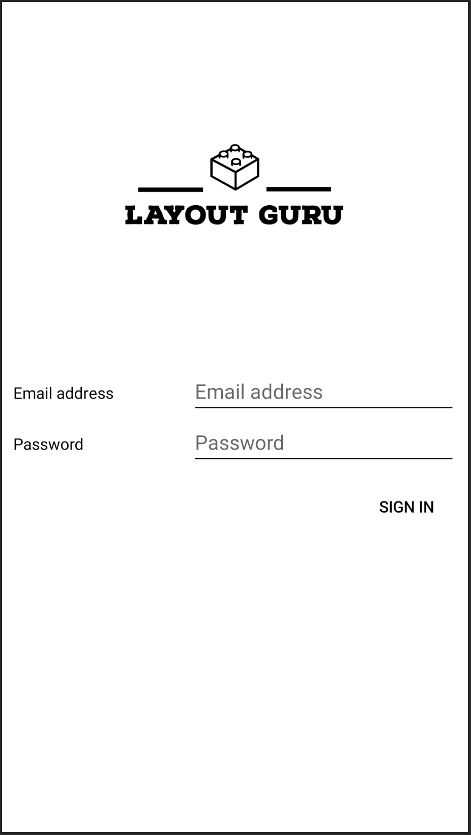
Figure 1: Layout Guru’s login screen
The view that we’re going to implement consists of two pairs of input fields and text labels centered on the screen. According to specification, each field takes up 60% of the screen width, and the text occupies the rest of the width. The application’s logo is centered above the fields, and uses 70% of the width. The “Sign In” button is positioned directly below the bottom input field and aligned to the right side of the screen.
Let’s start with one of the input text fields. The most straightforward way to implement it is with a horizontal LinearLayout. The layout_weight attribute will help us to set the desired width distribution. Here’s the layout’s XML:
    <LinearLayout
      xmlns:android="http://schemas.android.com/apk/res/android"
      android:orientation="horizontal"
      android:layout_width="match_parent"
      android:layout_height="wrap_content"
      android:weightSum="1">

      <TextView
        android:id="@+id/emailInputTitle"
        android:layout_width="0dp"
        android:layout_height="wrap_content"
        android:layout_weight="0.4"
        android:text="@string/email_address"
        android:textColor="@color/black" />

      <EditText
        android:id="@+id/emailInputField"
        android:layout_width="0dp"
        android:layout_height="wrap_content"
        android:layout_weight="0.6"
        android:inputType="textEmailAddress"
        android:autofillHints="Email"
        android:hint="@string/email_address"
        android:backgroundTint="@color/black" />

    </LinearLayout>
The second input is similar, but uses a different inputType’s value. Both inputs can be wrapped with a vertical LinearLayout:
    <LinearLayout
      xmlns:android="http://schemas.android.com/apk/res/android"
      android:orientation="vertical"
      android:layout_width="match_parent"
      android:layout_height="wrap_content">

      <include layout="@layout/email_field"/>
      <include layout="@layout/password_field" />

    </LinearLayout>
Finally, let’s combine the input fields with the rest of UI elements in a single RelativeLayout. For the first step of this process, we can add inputs to the layout and center them:
    <include
      layout="@layout/login_form"
      android:id="@+id/login_form"
      android:layout_width="match_parent"
      android:layout_height="wrap_content"
      android:layout_centerInParent="true" />
Then, we can add the “Sign In” button below the inputs, and align it to the right side of the screen:
    <Button
      style="?android:attr/borderlessButtonStyle"
      android:layout_width="wrap_content"
      android:layout_height="wrap_content"
      android:layout_marginTop="10dp"
      android:layout_below="@+id/login_form"
      android:layout_alignParentEnd="true"
      android:backgroundTint="@color/white"
      android:text="@string/sign_in"
      android:textColor="@color/black" />
The trickiest part, though, is the logo. Putting it above the inputs is easy, but there’s no straightforward way to make it take only 70% of the width of the screen using RelativeLayout. One way to achieve this is to put the image inside another LinearLayout, which has a convenient way of manipulating its child views’ weight (but doesn’t provide a way to position elements relative to each other):
    <LinearLayout
      android:orientation="horizontal"
      android:layout_width="wrap_content"
      android:layout_height="wrap_content"
      android:gravity="center_horizontal"
      android:layout_above="@+id/login_form"
      android:weightSum="1">

      <ImageView
        android:layout_width="0dp"
        android:layout_height="wrap_content"
        android:layout_weight="0.7"
        android:src="@drawable/logo"
        android:contentDescription="@string/layout_guru" />

     </LinearLayout>
And here’s an outline of the resulting XML:
    <RelativeLayout
      xmlns:android="http://schemas.android.com/apk/res/android"
      android:layout_width="match_parent"
      android:layout_height="match_parent"
      android:layout_marginStart="10dp"
      android:layout_marginEnd="10dp">

      <LinearLayout
        <!--...-->>
        <ImageView
          <!--...-->>
      </LinearLayout>

      <include
        <!--...-->>

      <Button
        <!--...-->>

    </RelativeLayout>
Looking at the result, we can already draw one important conclusion: even simple pieces of UI require a lot of code and mixing-and-matching of various layout types.
ConstraintLayout
Let’s look at how the same screen could be implemented using ConstraintLayout.
This time, let’s start by putting two EditTexts and two TextViews in the center of the screen, and placing them relative to one another exactly as we did before using a combination of multiple LinearLayouts. Because the text input fields are higher than their text labels, we constrain the top one to the parent’s top, the bottom one to the parent’s bottom, and combine them into a packed chain. This will make them centered vertically as a whole. Then, the text fields can be aligned to the inputs’ baselines. This is the corresponding XML snippet:
    <TextView
      android:id="@+id/emailInputTitle"
      android:layout_width="0dp"
      android:layout_height="wrap_content"
      android:text="@string/email_address"
      android:textColor="@color/black"
      app:layout_constraintBaseline_toBaselineOf="@id/emailInputField"
      app:layout_constraintStart_toStartOf="parent"
      app:layout_constraintWidth_percent="0.4" />

    <EditText
      android:id="@+id/emailInputField"
      android:layout_width="0dp"
      android:layout_height="wrap_content"
      android:autofillHints="Email"
      android:backgroundTint="@color/black"
      android:hint="@string/email_address"
      android:inputType="textEmailAddress"
      app:layout_constraintTop_toTopOf="parent"
      app:layout_constraintBottom_toTopOf="@+id/passwordInputField"
      app:layout_constraintStart_toEndOf="@id/emailInputTitle"
      app:layout_constraintVertical_chainStyle="packed"
      app:layout_constraintEnd_toEndOf="parent"
      app:layout_constraintWidth_percent="0.6" />

     <TextView
       android:id="@+id/passwordInputTitle"
       android:layout_width="0dp"
       android:layout_height="wrap_content"
       android:text="@string/password"
       android:textColor="@color/black"
      app:layout_constraintBaseline_toBaselineOf="@id/passwordInputField"
      app:layout_constraintStart_toStartOf="parent"
      app:layout_constraintWidth_percent="0.4" />

    <EditText
      android:id="@+id/passwordInputField"
      android:layout_width="0dp"
      android:layout_height="wrap_content"
      android:autofillHints="Password"
      android:backgroundTint="@color/black"
      android:hint="@string/password"
      android:inputType="textPassword"
      app:layout_constraintTop_toBottomOf="@+id/emailInputField"
      app:layout_constraintBottom_toBottomOf="parent"
      app:layout_constraintStart_toEndOf="@id/passwordInputTitle"
      app:layout_constraintEnd_toEndOf="parent"
      app:layout_constraintWidth_percent="0.6" />
The rest of the work is fairly straightforward. The image can be pinned to the top of the parent and to the top of the topmost input field. The relative width can be be provided using the layout_constraintWidth_percent attribute:
    <ImageView
      android:layout_width="0dp"
      android:layout_height="wrap_content"
      android:src="@drawable/logo"
      android:contentDescription="@string/layout_guru"
      app:layout_constraintTop_toTopOf="parent"
      app:layout_constraintBottom_toTopOf="@id/emailInputField"
      app:layout_constraintStart_toStartOf="parent"
      app:layout_constraintEnd_toEndOf="parent"
      app:layout_constraintWidth_percent="0.7" />
Positioning of the Button is simple as well:
    <Button
      style="?android:attr/borderlessButtonStyle"
      android:layout_width="wrap_content"
      android:layout_height="wrap_content"
      android:layout_marginTop="10dp"
      android:backgroundTint="@color/white"
      android:text="@string/sign_in"
      android:textColor="@color/black"
      app:layout_constraintTop_toBottomOf="@id/passwordInputField"
      app:layout_constraintEnd_toEndOf="parent"/>
An outline of the resulting layout is self explanatory:
    <androidx.constraintlayout.widget.ConstraintLayout
      xmlns:android="http://schemas.android.com/apk/res/android"
      xmlns:app="http://schemas.android.com/apk/res-auto"
      android:layout_width="match_parent"
      android:layout_height="match_parent"
      android:layout_marginStart="10dp"
      android:layout_marginEnd="10dp">

      <ImageView
        <!--...-->>

      <TextView
        <!--...-->>
      <EditText
        <!--...-->>

      <TextView
        <!--...-->>
      <EditText
        <!--...-->>

      <Button
        <!--...-->>

    </androidx.constraintlayout.widget.ConstraintLayout>
So, coming back to the original question—does ConstraintLayout replace other layouts? No doubt one can build a complicated UI by means of ConstraintLayout alone. Although, looking at the resulting code, some might prefer traditional options as being (arguably) easier to modularize and reuse, relatively complicated UI can be built simpler and using less code. The more sophisticated the UI, the more evident the statement becomes. This only confirms the conclusion from the previous section.
Another advantage of ConstraintLayout is that it’s more straightforward when building UI by means of the visual design tools of the Android Studio instead of coding it in XML.
Before we jump to conclusions, though, let’s look at another important metric: performance.
Layout Rendering Performance
Android provides us with useful developer tools that can help to measure rendering efficiency, one of which is Profile GPU Rendering. The output of the tool for each layout implementation will look something like this:
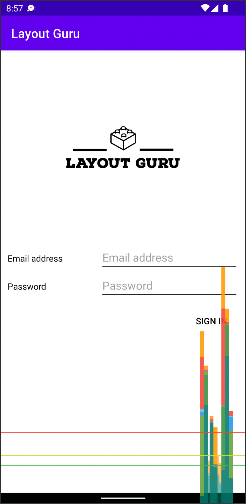
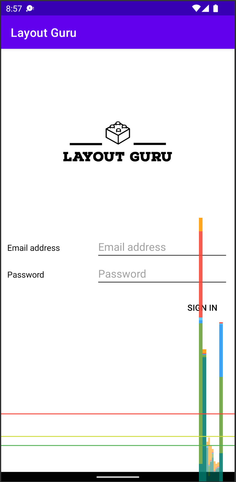
Figure 2: Profile GPU Rendering output for the two layouts, with ConstraintLayout on the right
The ConstraintLayout option, on the right, is slightly shorter on the horizontal axis, and has fewer red spikes, which translates to less CPU overhead.
Let’s also look at the output from another tool—Debug GPU Overdraw:
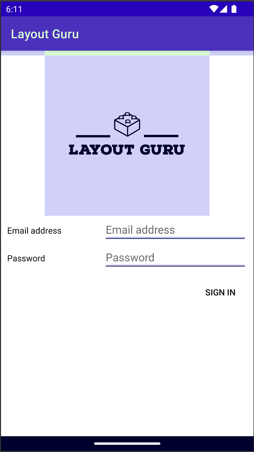
Figure 3: Debug GPU Overdraw output for the two layouts, with ConstraintLayout again on the right
The results are, again, very similar, but the RelativeLyout/LinearLayout version (on the left) has more purple areas—which mean areas that were redrawn once—and even one small green area indicating two redraws.
Although the difference between two layouts appears insignificant at first glance, in real-world situations with a more complicated user interface, the penalty can easily become noticeable and result in choppy animations and visible delays. Let’s explore why that’s the case.
Double Taxation
The phenomenon of slower rendering of nested layouts is widely referred to in the Android community as double taxation. While the system renders the view hierarchy, it iterates over the elements multiple times before finalizing the size and position of each view: At the first pass, the layout system calculates each child’s position and size based on the child’s layout After that, the system makes another iteration, taking into account the layout parameters of the parent layout. The more levels of hierarchy, the bigger the overhead. The problem applies to RelativeLayout, horizontal LinearLayout, and GridLayout.
If performance problems with rendering begin to occur, one of the first things to try is eliminating nested layouts wherever possible. Another potential way to experience an improvement is to switch to ConstraintLayout, which is cheaper in terms of underlying calculation because of its “flat” nature.
Conclusion
While choosing between the newer ConstraintLayout and other, more “traditional” alternatives, several factors should be considered. First of all, it's true that ConstraintLayout can turn into a universal solution for any type of UI. Additionally, for truly complicated user interfaces, ConstraintLayout can be a more lightweight and performant solution. On the other hand, in very simple cases where LinearLayout would provide a more straightforward solution, ConstraintLayout might be overkill.
Logging
If you need to log information related to rendering, Android has an interface called ViewTreeObserver.OnDrawListener that can be easily put to use together with a system to collect and store your log messages remotely, such as Shipbook.