
Another WWDC has come and gone, leaving in its wake a glut of new features and enhancements. Now that the initial excitement has passed, software developers across the world are thinking about how they can update their apps to benefit from these exciting new offerings. Improvements and evolution come at a cost, with API modernization accompanied by deprecations. SwiftUI is no exception in both regards, its updates offering both benefits and challenges to developers.
One of the most notable updates for SwiftUI is its navigation system. Navigation in SwiftUI has been a pain point for its users, especially with regard to bigger code bases, and Apple’s attention to navigation in this update will put a smile on the faces of many developers. But with this overhaul come new warnings and deprecations. Let’s take a look at SwiftUI’s navigation updates in practice and explore how to implement its features.
Putting SwiftUI Navigation to the Test
Apple’s examples for new updates are usually on the topic of food, but I’m more of a reader than a chef. We’ll build an application called Book Worm using SwiftUI’s new navigation features starring a collection of my favorite programming books.
We can understand what’s new in the field of SwiftUI navigation by building a simple app. The starting point of the app is a simple scrollable list. Tapping on a list item reveals the corresponding book details. From there, a third layer of the UI offers more in-depth information on that specific book.
Without further ado, let’s dive into coding.
Step One: Book List
As a warm-up, let’s create BookListCellView that will represent a single element of the book list. We don’t need anything complicated here, just a couple of text labels:
Stack(alignment: .leading) {
  Text(viewModel.authorsString)
  Text(viewModel.titleString)
    .font(.headline)
}
  .padding([.leading, .trailing])
I prefer to have separate view models for my views. Some people argue that it’s not a good idea, but I try to keep as much business and presentation logic out of the view layer as possible, because it helps unit testing and abstracting out layers.
In Book Worm all view models are pretty straightforward, but let’s also look at an underlying Book model that is at the heart of the data service of the app. You can now see what information the app shows to the end user:
struct Book: Decodable {
  let authors: [Author]
  let brief: String
  let id: String
  let title: String
  let year: String
}
struct Author: Decodable {
  let id: String
  let name: String
  let brief: String?
}
And here’s the body of the list view, BookListView, itself:
List(0..<viewModel.booksCount, id: \.self) {
  BookListCellView(
    viewModel: viewModel.cellViewModel(forIndex: $0)
  )
}
The MainView of the app only has the list for now:
var body: some View {
  BookListView(viewModel: viewModel.bookListViewModel)
}
This is how it looks on iOS:
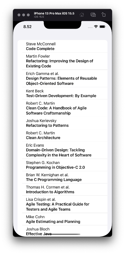
Figure 1: The book list on iOS
Not bad. Now let’s implement something more interesting.
Step Two: Book Details
The next step is to add a view for book details. Here’s the body of BookDetailsView:
VStack {
  Image(viewModel.imageName)
    .resizable()
    .scaledToFit()
    .frame(width: 200.0)
    .padding([.top], 8.0)
    .padding([.bottom], 40.0)
  Text(viewModel.title)
    .font(.title2)
    .multilineTextAlignment(.center)
  Text(viewModel.authors)
    .multilineTextAlignment(.center)
    .padding([.bottom], 8.0)
  Text(viewModel.year)
    .padding([.bottom], 8.0)
}
  .padding()
  .frame(maxWidth: 400.0)
There’s nothing too complicated here, but we’ve reached the point where we have to start implementing elements of navigation. In the list view, we need a NavigationLink instead of a plain cell view:
List(0..<viewModel.booksCount, id: \.self) { index in
  NavigationLink {
    BookDetailsView(
      viewModel: viewModel.detailsViewModel(forIndex: index)
    )
  } label: {
    BookListCellView(
      viewModel: viewModel.cellViewModel(forIndex: index)
    )
  }
}
NavigationLink allows us to present another view on top of the navigation stack, but we need a stack to get started with that. Prior to iOS 16, there was only one way to put everything into a stack, which was by wrapping the root view by a NavigationView:
NavigationView {
  BookListView(viewModel: viewModel.bookListViewModel)
}
This resulted in a traditional “push” behavior on iPhone in portrait orientation, and a two-column view on iPad, macOS, and iPhone in landscape orientation.
This method is now deprecated, but the only thing we need to change is to use NavigationStack instead of NavigationView. The former works well, but in more complicated cases, the new NavigationPath type offers important benefits. It can be stored outside the view layer, allowing us to implement proper routers or coordinators. It’s a huge step toward cleaner SwiftUI apps.
To understand this concept, let’s focus on the book details presentation from the list of books. First, we’ll need an ObservableObject that will store the NavigationPath of the app. The latter represents a data structure that stores the list of all currently presented views. The path can be manipulated as a regular array; you can add or remove view identifiers, and the navigation stack will be modified accordingly. Removing all elements from the path will pop all presented views and reveal the root view.
final class Router: ObservableObject {
  @Published var path = NavigationPath()
}
Let’s add a book details destination ID to the router:
final class Router: ObservableObject {
  enum Destination: Hashable {
    case details(book: Book)
  }
  func openDetails(of book: Book) {
    path.append(Destination.details(book: book))
  }
  // The rest of the code.
}
Since we’ve been using view models, it’s logical to put references to the router there, but this is where things can start to get messy. In order to initialize the navigation stack in the view, we need to expose the path to it. This introduces the problem of multiple sources of truth: Both the router (or whatever holds the path) and the navigation stack can modify the path. Here’s an extract from BookListView, where the stack is configured:
NavigationStack(path: $viewModel.path) {
  List(0..<viewModel.booksCount, id: \.self) {
    // ...
  }
}
In order to make that possible, we need to “republish” the path in the view model:
final class BookListDefaultViewModel: BookListViewModel {

  @Published var path = NavigationPath()
  private var cancellables: Set<AnyCancellable> = []

  init(/* ... */) {
    // ...
    router
      .$path
      .assign(to: \.path, on: self)
      .store(in: &cancellables)
  }

  // The rest of the code.

}
Then the view model can handle taps for the view:
func handleTap(on index: Int) {
  router.openDetails(of: bookService.books[index])
}
This method can be trivially called from the view:
List(0..<viewModel.booksCount, id: \.self) { index in
  Button {
    viewModel.handleTap(on: index)
  } label: {
    // Style the button.
  }
}
In BookListView, we need to provide a way for NavigationStack to know exactly which view it should present when an element is added to the current path. Although the view creation can be delegated, the view still knows about the destination type IDs, which makes things yet messier. Here’s the full body of the view:
NavigationStack(path: $viewModel.path) {
  List(0..<viewModel.booksCount, id: \.self) { index in
    Button {
      viewModel.handleTap(on: index)
    } label: {
      viewModel.cell(for: index)
    }
      .buttonStyle(.plain)
  }
    .navigationTitle("Books")
    .navigationDestination(for: Router.Destination.self) {
      viewModel.view(for: $0)
    }
}
Step Three: Details Placeholder
If you’re like me, you probably don’t like the empty space in the second column. This is an easy fix: We can add a placeholder to the navigation view, and it will be displayed by default. Once you use a navigation link from the left column, it will show the link’s destination view in the second column, replacing the placeholder view.
In iOS 15 it could be achieved by adding a second view into the NavigationView:
NavigationView {
  BookListView(viewModel: viewModel.bookListViewModel)
  EmptyDetailsView()
}
This is where one of the ugly sides of the NavigationView API reared its head: Nothing stopped us from adding a third view, which would result in the three-column navigation, or a fourth one, a fifth… On macOS, all of them would be nicely rendered as separate columns, but on mobile platforms things went south quickly and we ended up with a lot of undefined behavior. In the best case scenario, excessive columns would simply be invisible, but in the worst case, we had UI glitches and non-working navigation.
In iOS 16 a new NavigationSplitView was introduced to handle multi-column navigation:
NavigationSplitView {
  BookListView(viewModel: viewModel.bookListViewModel)
    .frame(minWidth: 200.0)
} detail: {
  EmptyDetailsView()
    .frame(minWidth: 300.0)
}
Here’s what we should have by now:
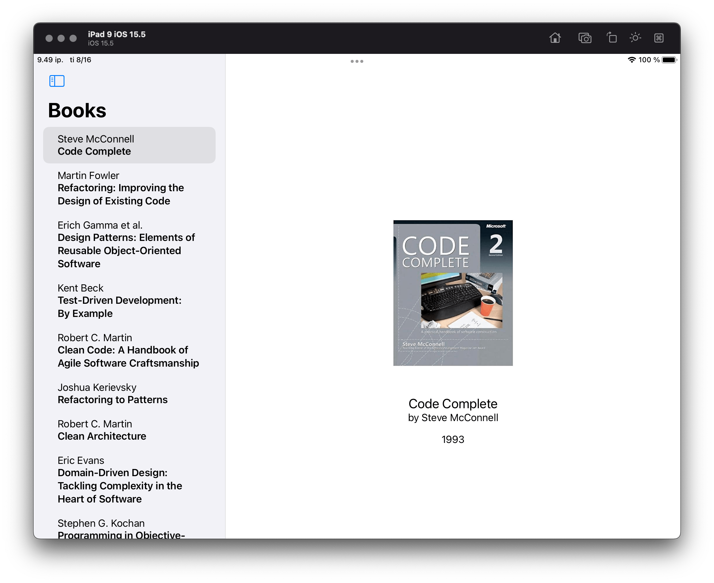
Figure 2: The book list with details on iPadOS
Step Four: Book Description
Let’s add another view to the app where we can show detailed information about the book. We’ll call it BookDescriptionView:
ScrollView {
  Text(viewModel.description)
}
  .padding()
We want to open the new view from BookDetailsView, using another navigation link. In iOS 15 the link could be activated with a boolean flag:
var body: some View {
  VStack {
    // The rest of the contents stay unchanged.
    NavigationLink(destination: BookDescriptionView(
      viewModel: viewModel.bookDescriptionViewModel
    ),
                    isActive: $detailsShown) {
      Text("Read more")
    }
      .padding([.bottom], 8.0)
  }
    .padding()
    .frame(maxWidth: 400.0)
}
This NavigationLink API was another reason the model of navigation in SwiftUI was criticized—it needed a boolean flag to indicate whether the link should present its destination view:
@State private var detailsShown = false
On one hand, the flag makes sense, because SwiftUI views describe the state—the idea that is called the “declarative approach,” as opposed to the imperative one. On the other hand, boolean flags are usually considered as code smell and can become messy if they are too numerous.
In iOS 16 flag-based navigation links are also deprecated in favor of the navigation path. Fortunately, in our simple case, we can get by on an automatic navigation link:
NavigationLink {
  BookDescriptionView(
    viewModel: viewModel.bookDescriptionViewModel
  )
} label: {
  Text("Read more")
}
All this works nicely for iOS and iPadOS, but if you run the app on macOS, the “Read more” button will be inactive. One way to overcome this is to wrap BookDetailsView with another NavigationView. On macOS this results in a three-column navigation view, but on iOS devices, you’ll see a lot of UI glitches.
Another option is to use a sheet-styled presentation, but this comes with its own problems. Firstly, it doesn’t fit the app’s visual concept. Secondly, it doesn’t work out of the box for macOS, so we would need to implement additional means for closing the sheet. Thirdly, determining size for the sheet would be tricky and would probably require us to use UIKit APIs like UIScreen. And fourthly, sheet presentations on SwiftUI require another boolean flag: isPresented.
In other words, this isn’t something you could write once and run anywhere.
Instead, let’s return to Book Worm and add a third column to our navigation model using new iOS 16 NavigationSplitView:
NavigationSplitView {
  BookListView(viewModel: viewModel.bookListViewModel)
    .frame(minWidth: 200.0)
} content: {
  EmptyDetailsView()
    .frame(minWidth: 300.0)
} detail: {
  EmptyView()
}
Explicitly named parameters content and detail remove the uncertainty of the indefinite set of views inside NavigationView’s content. If you want a two-column navigation, you just need to remove the content parameter.
Optionally, we could specify a columnVisibility argument for the NavigationSplitView initializer. It takes a Binding to a NavigationSplitViewVisibility variable. This new argument solves another problem with multi-column presentation in SwiftUI prior to iOS 16, namely the need to use UIKit and UISplitViewController to define the visibility of columns. This is how it looks if we want to keep all three columns constantly visible:
NavigationSplitView(columnVisibility: .constant(.all)) {
  // ...
}
This is how the three-column navigation view looks on macOS:

Figure 3: The book list with details and description in a separate view on macOS
Here you can download the final version of the app to play with.
Conclusion
With the iOS 16 release, SwiftUI continues to evolve. Along with various new classes, methods, and techniques, we are also starting to see deprecations. This suggests that SwiftUI is no longer a novelty, but rather a serious way to build your applications.
Since SwiftUI was first released, developers have been struggling with creating clean and maintainable navigation in their big code bases. Apple has responded to this problem, and the new SwiftUI navigation types are a major step toward an easier build and maintain experience for developers. The system still has room for improvement, but knowing Apple, we won’t have to wait long for an even sleeker navigation experience for users and developers alike.